

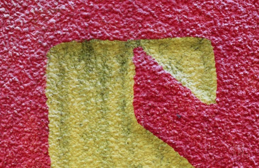
“Century” is the focus of this week’s critique. It is a photo of a Century logo on a fire hydrant. It was taken about two weeks ago. The fire hydrant was close to where I live. Let’s talk about the photo’s strengths and weaknesses.
The colours of the photo are very striking. As you can see, the vibrant red is intimately set against a dingier yellow. If you look closely at the yellow negative space, it looks like the top portion of a “5” or a “S.”
I also like the texture of of this photo. You can definitely see the rough and bumpy texture that dominates on this fire hydrant. The singular texture and dual colour scheme create a very simple composition.
One potential weakness is that the photo may be too simplistic. Does the colour, graphic nature, or texture enough to keep your attention? Or will you lose interest very quickly after just a glance?
If you didn’t know that this was a logo on a fire hydrant, would you look at the photo and give up on it because you had no idea what the photo was? Is it too abstract?
Please let me know what you think! Thanks!

Love, love love this photo. The colours, the texture, the simplicity, it’s a really good photo. Regardless of what it is, I think the interest comes from the abstract nature of it. Really excellent. Love it.
if I had to be a stickler, and have one point of criticism, it’s that the lines of the yellow symbol are not straight straight, they’re ever so slightly off. If it was straight, I think this photo would be absolutely perfect.
LikeLiked by 1 person
Shaun, you are truly a great photo critic! Thank you for your wonderful comment! I was afraid that the photo was too simplistic or abstract. But you are absolutely right: the interest comes from the abstract nature of the photo.
Yes, I can see what you mean. The top line is slightly off, not straight. Thank you for pointing that out!
I just wanted to say that I have really enjoyed reading your feedback and criticism. Their fresh, smart, and very accurate. So thank you!
LikeLiked by 1 person
No need to thank me, you take good photos and you respectfully ask for criticism whilst starting the conversation by critiquing it yourself. I found your posts refreshing, open and honest 🙂
Have followed your blog and will look out for your work in future.
LikeLiked by 1 person
Thanks again for your kind words and for the follow!
Take care!
LikeLike