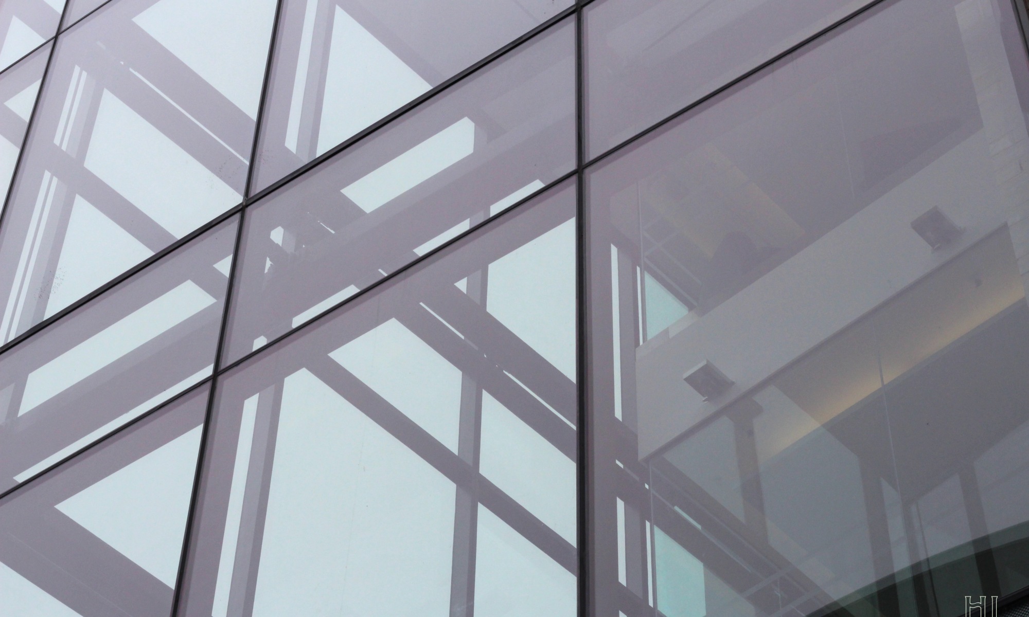
“Framed” is our photo for this week’s critique. It’s a picture of the medical building on Queen’s campus. It was taken in May. Let’s go over its strengths and weaknesses.
This photo is all about lines. You can see there are lines going horizontally and vertically. What I especially like is the criss-crossing of the lines to form “X’s” on the left side. There are three of these “X’s” going diagonally across the photo.
I also like the muted monochromatic-like colour in this photo. The soft faint blue colour of the glass creates a melancholy mood.
To me, the structure inside the building on the right side ruins the photo. It disrupts the lines, and monochromatic colour scheme.
This photo looks a bit underexposed. Does this add a moodiness to the photo? Or would the photo look better with more light?
Please let me know what you think! Thanks!

