Five Sculptures – Critique

FiveSculptures

For this week’s critique we will examine “Five Sculptures.”  It’s a photo of art sculptures on Queen’s campus called “Five Sculptures on Topological Themes” by Alan Dickson.  It was taken in August.  Let’s go over its strengths and weaknesses.

Composing this photo was a bit challenging.  I took many photos at various positions around the sculpture to find a sweet spot.  To me this was the best viewpoint.  Here, the sculptures create an order, going from  tallest on the right to shortest on the left.   This order generates an interesting invisible diagonal line drawn through the tops of the sculptures.

There is a nice juxtaposition of living things and non-living things.  You can see the grey lifeless art pieces are placed before the living green trees and plants.  I like this contrasting theme.

Would the photo look cleaner if I had gotten closer to the sculptures?  Is the red hanging pot of flowers distracting?

Are the buildings in the background taking away the spotlight from the sculptures?

Please let me know what you think!  Thanks!

Framed – Critique

MedicalBldg

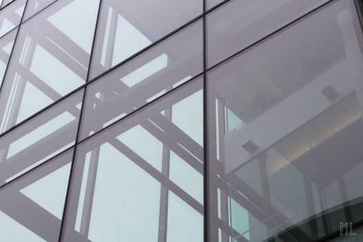
“Framed” is our photo for this week’s critique.  It’s a picture of the medical building on Queen’s campus.  It was taken in May.  Let’s go over its strengths and weaknesses.

This photo is all about lines.  You can see there are lines going horizontally and vertically.  What I especially like is the criss-crossing of the lines to form “X’s” on the left side.  There are three of these “X’s” going diagonally across the photo.

I also like the muted monochromatic-like colour in this photo.  The soft faint blue colour of the glass creates a melancholy mood.

To me, the structure inside the building on the right side ruins the photo.  It disrupts the lines, and monochromatic colour scheme.

This photo looks a bit underexposed.  Does this add a moodiness to the photo?  Or would the photo look better with more light?

Please let me know what you think!  Thanks!
Regal – Critique

PeonyPink17

Our photo for this week’s critique is “Regal.”  It’s shows a pink and purple flower.  I believe it’s a peony but I’m not certain.  The picture was taken in June.  Let’s discuss what works well and what needs improvement.

I love the sharpness of the pink flaky petals.  You can see the details in the petals like the smooth texture and the transition in colour.

Speaking of colours, the colours in this photo rock.  The different shades of pink are the stars of the show.  Bold purple petals lie behind the pink centre and creates a beautiful background.

Here, the focus isn’t on the exact centre of the flower.  Should I have focused in the centre? Would that make a better photo?

This was a very tight, close-up shot of the flower.  Am I too close?  Would backing up a bit help with the composition?

Please let me know what you think!  Thanks!

Tropical Beach – Critique

FireHydrant2

For this week’s critique, we will look at “Tropical Beach.”  It’s a close-up photo of a fire hydrant near my place.  The photo was taken in mid-May.  Let’s go over its strengths and weaknesses.

This photo is purely about colours.  You can see that it has a dual colour scheme, turquoise and yellow.  The colours are in opposition: warm yellow clashing with cool turquoise.

This photo is also purely about shapes.  We can distinctly see squares and circles dominate in this picture.

I think this photo suffers from a focusing problem.  It would have been better if the background was also in focus.

Would the composition be stronger if I had placed the square in centre? Does the present placement work, or would a symmetrically centred photo look better?

Please let me know what you think!  Thanks!


Looker – Critique

Summerhill17

Our photo for this week’s critique is “Looker.”  It shows Summerhill, a stately house on Queen’s campus.  The photo was taken in mid-May.  Let’s go over what works and what could be improved.

The photo clearly shows off the neoclassical architecture of the building.  We can clearly see the beautiful white columns, the elegant curvature, and precise stone work.

I also like the greenery on the right side.  The foliage from the tree branches adds a nice touch of nature to the otherwise man-made structure.

The Biology building in the background spoils the beauty of photo.  I just don’t like the drab brown facade of the it behind Summerhill and the trees.

This photo looks very gloomy.  The overcast sky is likely responsible for this.  Bright sunshine would have improved the overall mood of the photo.

Please let me know what you think!  Thanks!

Pretty in Pink – Critique

PinkBlossom

This week’s critique is on “Pretty in Pink.”  It’s a photo of pink and white blossoms.  It was taken in mid-May of this year near my house.  Let’s discuss its strengths and weaknesses.

I think one of its strengths is its image quality.  The photo is sharp, and you can see fine details in the flowers.

If you have been following my critiques, you would know that I often don’t like my backgrounds especially for my flower shots.  Surprisingly, I actually like the background of this photo.  I like mottled appearance of it and the three simple colours: white, pink and green.

The exposure is potentially a weakness here.  Some parts of the photo, particularly the white petals near the top, look like they are slightly overexposed.

The composition could have also been improved.  This is a very lopsided photo.  Most people would pay attention to the right side.  I think moving the flowers a tad to the left would help this.

Please let me know what you think!  Thanks!


Handsome – Critique

ChernoffFacade

For this week’s critique, we’ll look at “Handsome.”  It’s a photo of the facade of Chernoff Hall on Queen’s Campus.  It was taken over a month ago.  Let’s go over it’s strengths and weaknesses.

One of the strengths of this photo is the viewpoint.  Here, the camera was angled so that the structure and frames are not vertical but are instead on a diagonal.  It creates a very different and interesting composition.

There is also an element of repetition.  We can see that the frames in the windows and the limestone structures are repeated.  It gives a very pleasing design.

As for weaknesses, this photo has a somewhat distracting object in it.  The branches on the right side to me doesn’t add to the photo.

As you can see, the photo was taken on an overcast sky.  I wonder if it would have worked better on a bright sunnier day.  That way more shadows would have been casted to reveal the structure better.  Also, the textures would have been more pronounced.

Please let me know what you think!  Thanks!

Fiery – Critique

FieryTulip

This week’s critique is on “Fiery.” It’s a photo of tulips found in front of Dunning Hall on Queen’s University Campus.  It was taken about a month ago.  Let’s go over what works well and what could be improved.

The colours in this photo are what instantly grabs your attention.  Reds, oranges, and yellows abundant in this photo suggest hot fire.  The cool greens nicely complements these warm hues.

We have some pretty good bokeh in this photo.  There are subtle circular bokeh just to the right of the tulip in focus.

The condition of the main tulip could be better.  As you can see, it’s starting to wilt and die off.

The background is somewhat disorganized.  There is no pattern to the tulips in the background.  It just looks cluttered and all over the place.  I think if I had angled the camera lower, I might have gotten a photo where all the tulips heads were aligned.

Please let me know what you think! Thanks!

House of Knowledge – Critique

StaufferWalk

Our photo for this week’s critique is “House of Knowledge.” It depicts a walkway outside of Stauffer Library on Queen’s University campus.  It was taken about three weeks ago.  Let’s look at the positives and the negatives of this photo.

The repetition in this photo is one of the positives.  You can see that there are repeating elements in this photo,  the columns on the left, the benches, the trees, and the plants beside the trees.  The repeated elements create a regular rhythm moving from the edges of the photo to the centre.

One more positive is the sense of linear perspective in this photo.  The columns and the trees gradually become smaller and diminish towards the vanishing point near the middle of the photo.

One negative is that both the repetition and linear perspective is very short.  If the pattern was continued for a longer distance, the photo would have been more spectacular.

Another low point is the distracting eye sore in the photo.  That eye sore is the ugly trash container in the centre right.  I should have paid more attention to it when I was taking the photo.

Please let me know what you think! Thanks!

Justice – Critique

CourtHouse

For this week’s critique, we will look at “Justice.”  It’s a photo of the Frontenac County Court House near Queen’s University campus in Kingston, Ontario.   The photo was captured a little more than two weeks ago.  Let’s discuss what works well and what needs improvement.

What works well is the relationship between the fountain and the court house.   The much smaller fountain in the foreground acts like a stepping stone, or an antechamber, to the much larger court house.  You would “leap” from the fountain before landing on the court house.

I also like the minimal colours in this photo.  There are basically four dominant colours, brown, turquoise, grey and white.   The white in the sky really isolates and brings attention to the architecture of the building.  The minimal colours also simplify the photo, and help to focus attention on the geometric shapes and textures.

What could be improved is perhaps the composition.  You can see that the fountain and the building’s name are cut off.   Would it have looked better with those intact?

This photo was taken on an overcast day.  I wonder whether it would have looked more cheerful if the sun was out?  Do you think the colours are a bit drab here?

Please let me know what you think! Thanks!